


Bayut Token System
Built a semantic token foundation to scale Bayut's design system across mobile, reducing inconsistency, lowering maintenance cost, and preparing the system for theming (including dark mode).
RoleLeading the Design System
TeamTech — 12 Mobile App Engineers, Product — 2
Timeline1 month
Problem Statement
We needed a design foundation that:
- Reduced UI drift across squads and surfaces
- Lowered rework caused by inconsistent component edits
- Enabled theme readiness (dark mode + future brand experiments) without redesigning the system later
As the primary designer on the Bayut app, I needed a system that could scale beyond a single contributor. This work ensures that any designer collaborating on the app can move faster, stay consistent, and build with confidence.
Product & Engineering — Clear tokens and documented system rules reduce doubt, making design decisions easier to implement and maintain over time.
Audit for Token Taxonomy
Before defining a token structure, I audited our existing patterns and benchmarked mature systems that operate at scale (e.g., Atlassian's semantic token structure and how teams map tokens from theme → component usage). The audit helped isolate the failure modes we were experiencing internally:
- Tokens tied too closely to specific components/values
- Unclear rules for usage across states
- Lack of documentation leading to "detach + tweak" behavior
This became the input for token taxonomy optimized for long-term scalability.


Industry design system references for semantic token taxonomy
Key outcome of the audit: a shortlist of naming patterns and a "minimum viable semantic set" that could scale across most surfaces without exploding complexity.
Process for Bayut Tokens
To define semantic tokens, I used a single detail view screen which consists of a high number of reusable components and could be a source of truth. This helped me add realistic tokens with the help of knowing the intent, component and the usage.
I mapped every UI element on that screen to semantic tokens, then stress-tested the taxonomy across additional screens and themes. This approach surfaced gaps early and ensured the system could scale without redesigning the token structure later.

Process for Bayut tokens — detail view mapping
Based on the audit across key areas of the app, I identified a core set of semantic naming patterns that could scale reliably across the system. Rather than tying tokens to specific colors or components, the taxonomy was structured around usage, purpose, and state.
Tokens were defined across three primary dimensions: Attribute (Text, Background, Icon, Border), Purpose (Error, Info, Positive, Neutral), and State (Default, Action).

Token writing — semantic dimensions
These tokens were then implemented as variables in Figma and mapped directly to component usage. This ensured the system was flexible to use for future theming as well.
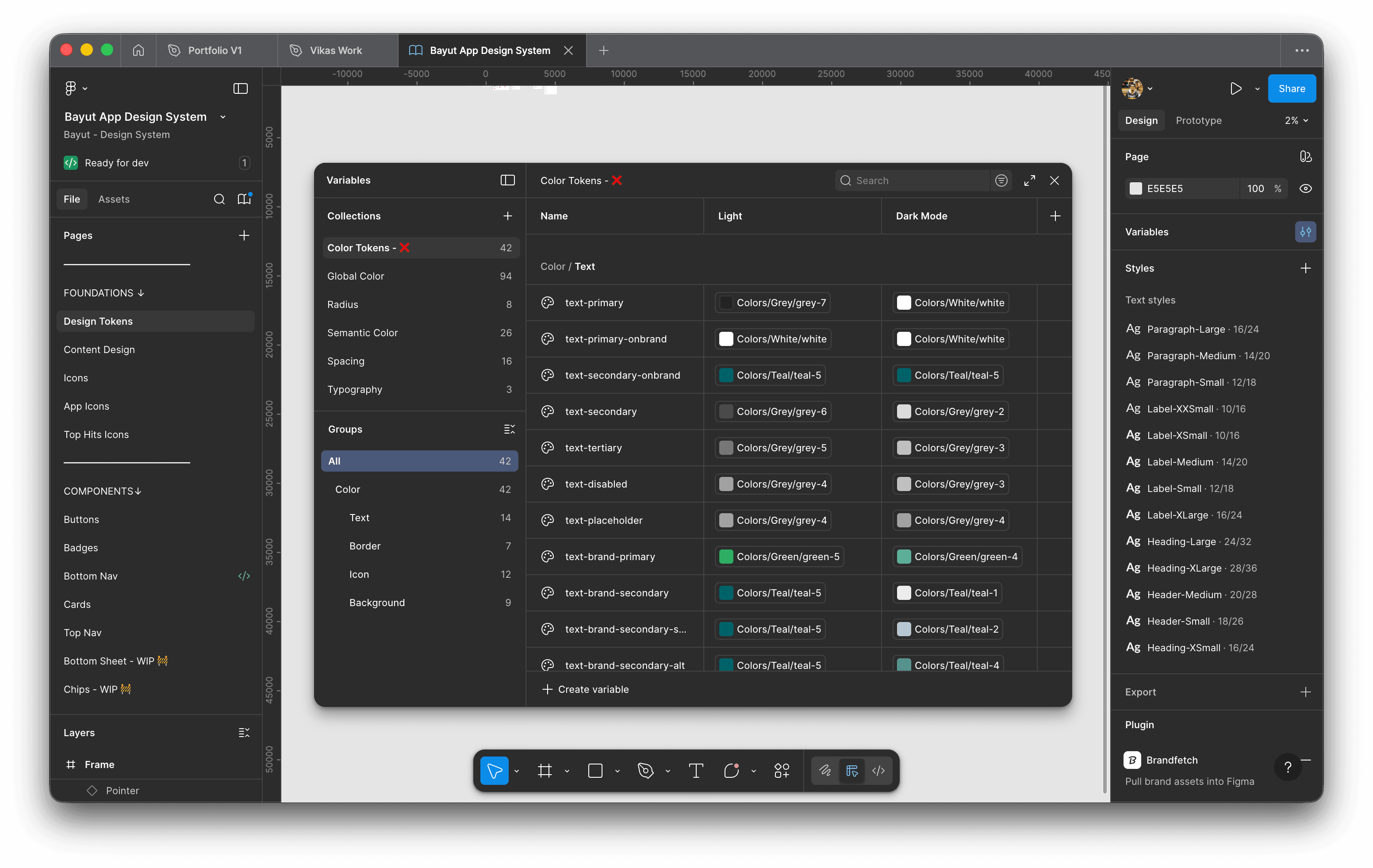
Figma variables and component usage
What We Chose Not to Tokenise
There were some decisions on what to tokenize and it was mainly on reusable component level and basic elements to reduce any complexity in maintenance.
- Highly illustrative / decorative UI where values are art-directed and not semantically meaningful
- Experimental patterns without stable intent (tokens would lock us into premature structure)
- One-off visuals that don't repeat across surfaces
Illustrative elements

Experimental components
Decisions on what not to tokenise
Component Documentation
As component tokens were introduced, we began to see repeated breakages—often caused by components being detached or modified incorrectly during rapid design work. This made it clear that tokens alone were not enough without clear guidance on how components should be used and extended.
I started by documenting the most complex UI components—such as bottom sheets with multiple states and configurations—where the risk of misuse was highest. From there, the same documentation patterns were applied to simpler components across the system.
The documentation focused on: preserving component structure while enabling fast iteration; clearly defining configurable states and variants; helping designers work efficiently without breaking underlying logic. By pairing component documentation with token usage, the system became easier to scale, safer to modify, and more resilient as the app continued to evolve.
I started by documenting the most complex UI components—such as bottom sheets with multiple states and configurations—where the risk of misuse was highest.
Component documentation examples
Outcomes
This initiative laid the foundation for a more scalable and maintainable design system at Bayut. While full engineering adoption is still in progress, the token framework has already enabled faster exploration, reduced design inconsistency, and clarified how themes could be supported in the future.
By defining semantic tokens upfront, the system is now structurally ready for features such as dark mode and theme-level experimentation for future theme designs.
This work was initiated as a solo effort and designed to be extensible, ensuring it could scale as more stakeholders and engineers are brought into the process.
Outcomes — design system in practice
Key Learnings
Design debt
Design debt harms the design team and the lack of early system documentation led to inconsistencies and rework.
Component consistency
Manually breaking and reassembling components to handle small variations introduced inconsistencies that were often missed during handoff, increasing design QA and implementation risk.
Slots and variables
Using slots for a bigger component and using variables smartly does the job for multiple use cases which keeps the component future proof.